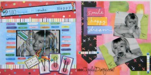
This layout plays with a lot of complimentary bright pattern papers so the photos featured in black and white offers a nice contrast. Cutting the photo into strips on the left page shows the fun paper behind. With this technique just be sure not to cut through faces. (Click on photo again if you would like to enlarge.)

